css3如何实现边框阴影
1、边框阴影(box-shadow)的基本语法:
box-shadow:color h-shadow v-shadow blur spread inset;
color:阴影颜色 ------------ 可选
h-shadow :水平偏移量 ----必选
v-shadow:垂直偏移量-----必选
blur:模糊距离 -------------可选
spread:阴影尺寸---------- 可选
inset:内阴影 --------------可选
例子:
css部分:
.div1{
width:200px;
height:200px;
margin:20px auto;
line-height: 200px;
text-align: center;
background: cadetblue;
border:2px solid darkslategray;
box-shadow: darkgrey 10px 10px 30px 5px ;//边框阴影
}
html部分:
<div class="div1">边框阴影示例</div>
效果如图:

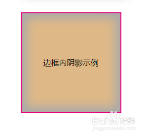
2、内外阴影
在边框阴影(box-shadow)的基本语法中,参数inset是可选可不选的,选参数inset,将外部阴影改为内部阴影;而不选参数inset,即默认情况下是外部阴影的。
例子:
css部分:
.div2{
width:200px;
height:200px;
margin:50px auto;
line-height: 200px;
text-align: center;
background: burlywood;
border:2px solid #e4007e;
box-shadow: darkgrey 0px 0px 30px 5px inset;//边框内阴影
}
html部分:
<div class="div2">边框内阴影示例</div>
效果如图(对比内外阴影效果):

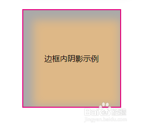
3、偏移量( h-shadow 、 v-shadow)
在上面第二步的基础上添加水平和垂直10px的偏移量。对于外阴影,偏移量相当于从图形的正后方,向右下进行了偏移;而对于内阴影,偏移量相当于图形内部没有被阴影覆盖的部分向右下进行了偏移。
例子:
css部分:
.div2{
width:200px;
height:200px;
margin:50px auto;
line-height: 200px;
text-align: center;
background: burlywood;
border:2px solid #e4007e;
box-shadow: darkgrey 10px 10px 30px 10px inset;//边框内阴影
}
html部分:
<div class="div2">边框外阴影示例</div>
效果如图(对比内外阴影偏移量的区别):

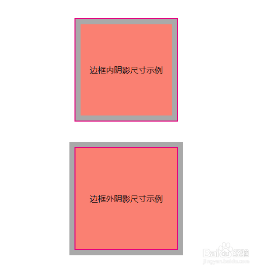
4、阴影尺寸(参数spread)
阴影尺寸就是指阴影外延出去总的长度。将除阴影尺寸以外的值都设置为0,就能直观的查看阴影尺寸。
例子:
css部分:
.div3{
width:200px;
height:200px;
margin:50px auto;
line-height: 200px;
text-align: center;
background: salmon;
border:2px solid #e4007e;
box-shadow: darkgrey 0px 0px 0px 10px inset;
}
.div4{
width:200px;
height:200px;
margin:50px auto;
line-height: 200px;
text-align: center;
background: salmon;
border:2px solid #e4007e;
box-shadow: darkgrey 0px 0px 0px 10px;
}
html部分:
<div class="div3">边框内阴影尺寸示例</div>
<div class="div4">边框外阴影尺寸示例</div>
效果如图:
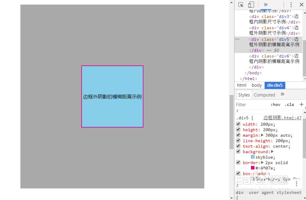
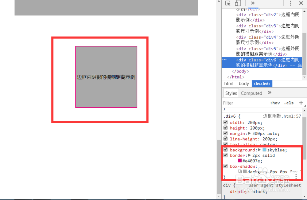
5、模糊距离(blur)
把除模糊距离外的其他值都设置为0,模糊距离设置为200px,与边长相等,对比边框内外阴影的效果
例子:
css部分:
.div5{
width:200px;
height:200px;
margin:300px auto;
line-height: 200px;
text-align: center;
background: skyblue;
border:2px solid #e4007e;
box-shadow: darkgrey 0px 0px 0px 200px;
}
.div6{
width:200px;
height:200px;
margin:300px auto;
line-height: 200px;
text-align: center;
background: skyblue;
border:2px solid #e4007e;
box-shadow: darkgrey 0px 0px 0px 200px inset;
}
html部分
<div class="div5">边框外阴影的模糊距离示例</div>
<div class="div6">边框内阴影的模糊距离示例</div>
效果如图:
从图中可以发现,模糊距离和阴影尺寸是不同的,模糊距离设为200px正好填充了内阴影图形的内部,阴影尺寸等于外延长度,而模糊距离的外延长度这是设定值的二分之一。