html+css3适合移动手机的侧边栏滑动代码
1、新建html文档。

2、书写html。
<nav id="menu" class="menu"> <a href="#" target="_blank">
<header class="menu-header"> <span class="menu-header-title">1111111</span> </header>
</a>
<section class="menu-section">
<h3 class="menu-section-title">2222222</h3>
<ul class="menu-section-list">
<li><a href="#" target="_blank">333333</a></li>
<li><a href="#" target="_blank">44444</a></li>
<li><a href="#" target="_blank">55555</a></li>
<li><a href="#" target="_blank">66666</a></li>
</ul>
</section>
<section class="menu-section">
<h3 class="menu-section-title">77777</h3>
<ul class="menu-section-list">
<li><a href="#" target="_blank">888888</a></li>
<li><a href="#" target="_blank">9999</a></li>
<li><a href="#">aaaaa</a></li>
</ul>
</section>
<section class="menu-section">
<h3 class="menu-section-title">bbbbb</h3>
<ul class="menu-section-list">
<li><a href="#" target="_blank">ccccc</a></li>
<li><a href="#" target="_blank">ddddd</a></li>
</ul>
</section>
</nav>
<main id="main" class="panel">
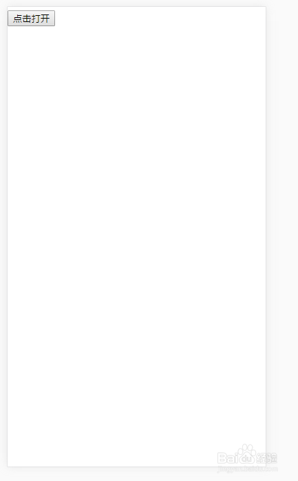
<button class="btn-hamburger js-slideout-toggle"> <span class="tooltip">点击打开</span> </button>
</main>

3、书写css样式。
<style type="text/css">
html { font-family: sans-serif; -ms-text-size-adjust: 100%; -webkit-text-size-adjust: 100% }
body { margin: 0 }
html, body { width: 100%; height: 100%; }
body, .panel { background-color: #fff; }
.menu { background-color: #1D1F20; background-image: linear-gradient(145deg, #1D1F20, #404348); }
a { color: #4B5; text-decoration: none; }
.menu a { color: #fff; }
.menu a:hover { text-decoration: underline; }
.menu-header-title { font-weight: 400; letter-spacing: 0.5px; margin: 0; }
.menu-section { margin: 25px 0; }
.menu-section-title { text-transform: uppercase; color: #85888d; font-weight: 200; font-size: 13px; letter-spacing: 1px; padding: 0 20px; margin: 0; }
.menu-section-list { padding: 0; margin: 10px 0; list-style: none; }
.menu-section-list a { display: block; padding: 10px 20px; }
.menu-section-list a:hover { background-color: rgba(255, 255, 255, 0.1); text-decoration: none; }
.panel { text-align: left; padding-top: 5px; min-height: 100%; }
.slideout-menu { position: fixed; left: 0; top: 0; bottom: 0; right: 0; z-index: 0; width: 256px; overflow-y: auto; -webkit-overflow-scrolling: touch; display: none; }
.slideout-panel { position: relative; z-index: 1; }
.slideout-open, .slideout-open body, .slideout-open .slideout-panel { overflow: hidden; }
.slideout-open .slideout-menu { display: block; }
</style>

4、书写js特效并引用<script type="text/javascript" src="js/slideout.min.js"></script> 。
<script type="text/javascript">
var slideout = new Slideout({
'panel': document.getElementById('main'),
'menu': document.getElementById('menu'),
'padding': 256,
'tolerance': 70
});
document.querySelector('.js-slideout-toggle').addEventListener('click', function() {
slideout.toggle();
});
document.querySelector('.menu').addEventListener('click', function(eve) {
if (eve.target.nodeName === 'A') { slideout.close(); }
});
function aload(t){"use strict";t=t||window.document.querySelectorAll("[data-aload]"),void 0===t.length&&(t=[t]);var a,e=0,r=t.length;for(e;r>e;e+=1)a=t[e],a["LINK"!==a.tagName?"src":"href"]=a.getAttribute("data-aload"),a.removeAttribute("data-aload");return t}
window.onload = function(){
aload();
document.querySelector('.iphone').className += ' shown';
}
</script>
5、页面代码整体结构。

6、查看效果。“未点击”
7、查看效果。“点击之后”
